> ## Documentation Index
> Fetch the complete documentation index at: https://docs.larafast.com/llms.txt
> Use this file to discover all available pages before exploring further.

# Features

> import Features from @/components/Features.vue;

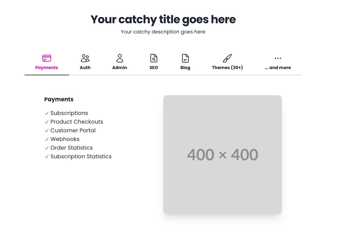
The `Features` component is designed to showcase a set of features in a visually appealing manner. It includes a title, a brief description, and a list of features with accompanying icons. The component has a responsive layout, making it suitable for various screen sizes.

<Frame>
  <img src="https://mintcdn.com/larafast/p7p6xbnL6MINm0mR/images/components/feature-items.jpg?fit=max&auto=format&n=p7p6xbnL6MINm0mR&q=85&s=46a6d21a59818a1e68d50218bac10107" width="1134" height="739" data-path="images/components/feature-items.jpg" />
</Frame>

To use the `Features` component in your Vue.js application, you can import it and include it in your template.

```html resources/js/Components/Features.vue theme={null}
<div class="max-w-4xl mx-auto sm:py-8 sm:pt-0">
        <div class="mb-12 max-w-2xl text-center mx-auto px-4 sm:px-0">
            <Heading>
                Your catchy title goes here
            </Heading>
            <p class="mt-2 text-md leading-6">
                Your catchy description goes here
            </p>
        </div>
        <!-- The tabs section-->
        <div role="tablist" class="tabs tabs-bordered overflow-y-scroll">
            <div class="tab h-24 w-24 sm:w-full sm:h-20" v-for="(tab) in tabs" role="tab" @click="switchTab(tab)" :class="{'tab-active': tab.slug === activeTab.slug}">
                <div class="flex flex-col justify-start items-center">
                    <CreditCardIcon v-if="tab.slug === 'payments'" :class="{'text-secondary': activeTab.slug === 'payments'}" class="w-8 h-8"/>
                    <UsersIcon v-if="tab.slug === 'auth'" :class="{'text-secondary': activeTab.slug === 'auth'}" class="w-8 h-8"/>
                    <UserIcon v-if="tab.slug === 'admin'" :class="{'text-secondary': activeTab.slug === 'admin'}" class="w-8 h-8"/>
                    <DocumentMagnifyingGlassIcon v-if="tab.slug === 'seo'" :class="{'text-secondary': activeTab.slug === 'seo'}" class="w-8 h-8"/>
                    <PaintBrushIcon v-if="tab.slug === 'themes'" :class="{'text-secondary': activeTab.slug === 'themes'}" class="w-8 h-8"/>
                    <DocumentTextIcon v-if="tab.slug === 'blog'" :class="{'text-secondary': activeTab.slug === 'blog'}" class="w-8 h-8"/>
                    <EllipsisHorizontalIcon v-if="tab.slug === 'more'" :class="{'text-secondary': activeTab.slug === 'more'}" class="w-8 h-8"/>
                    <span class="block font-bold" :class="{'text-secondary': tab.slug === activeTab.slug}">{{ tab.title }}</span>
                </div>
            </div>
        </div>
        <!-- The feature items section-->
        <FeatureItems :activeTab="activeTab"/>
    </div>
```

Component also has js methods that are responsible for switching tabs and displaying the appropriate content.

```js resources/js/Components/Features.vue theme={null}

const activeTab = ref({title: 'Payments', slug: 'payments'});

const tabs = [
    {title: 'Payments', slug: 'payments'},
    {title: 'Auth', slug: 'auth'},
    {title: 'Admin', slug: 'admin'},
    {title: 'SEO', slug: 'seo'},
    {title: 'Blog', slug: 'blog'},
    {title: 'Themes (30+)', slug: 'themes'},
    {title: '... and more', slug: 'more'}
];

const switchTab = (tab) => {
    activeTab.value = tab;
}
```

To display the active tab content, you can use the `FeatureItems` component, which accepts the `activeTab` prop.